

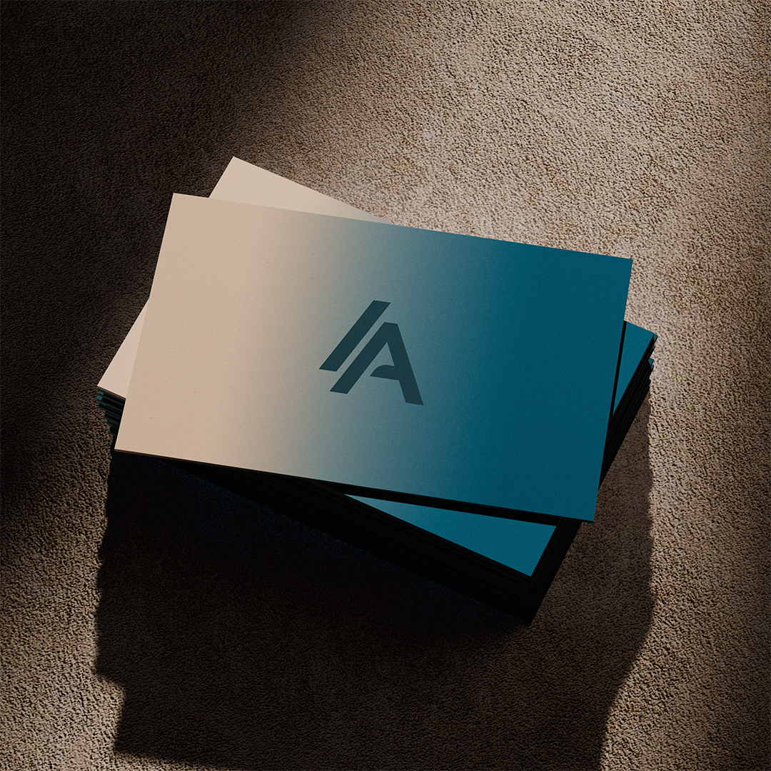

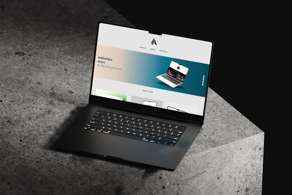
For Anchorline Systems, I developed a complete brand identity for a London-based web development proffesional, creating a visual language that reflects precision, structure and technical expertise. The project centred around establishing a distinctive identity that could communicate professionalism while still feeling contemporary and adaptable within a fast-moving digital landscape.
The identity was built around a bold geometric monogram, using the forms of the letter A to create a mark that feels architectural, progressive and highly recognisable. A restrained typographic system and deep, technical colour palette were developed alongside it, supported by subtle gradients and graphic treatments that introduce depth without compromising clarity.
The result is a flexible brand system designed to work confidently across both digital and physical applications. From web environments and presentations through to stationery and printed collateral, the identity gives Anchorline Systems a consistent and considered presence while leaving room for the brand to evolve alongside the business.
The approach balanced strategy and aesthetics, prioritising clarity and hierarchy. The final system allows the dishes to take centre stage while delivering a consistent and recognisable brand experience.